2016金點設計獎 包裝類
睿和茶品牌禮盒「五輪觀」
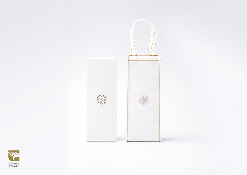
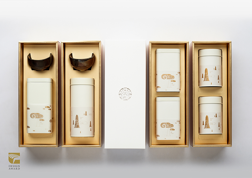
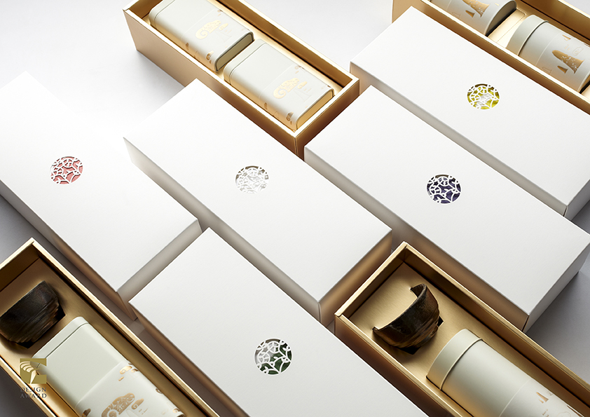
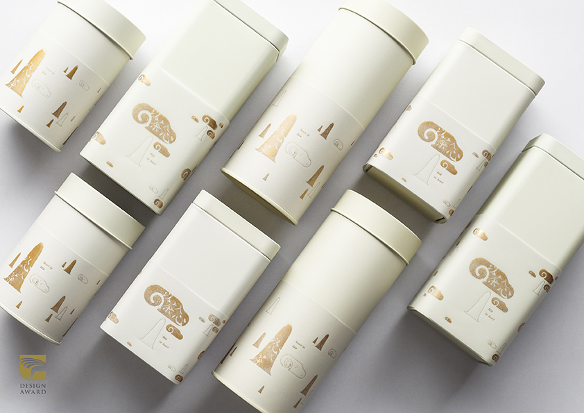
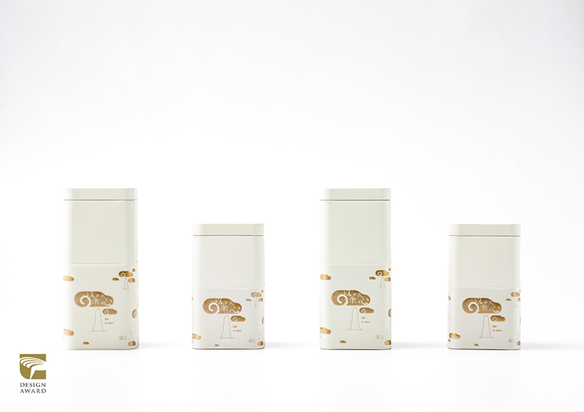
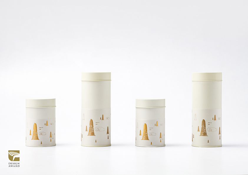
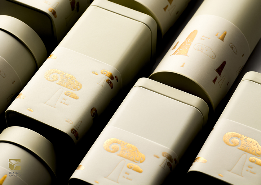
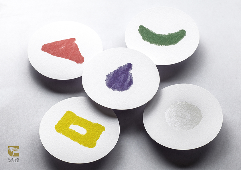
將「印度佛教中的五輪觀:地、水、火、風、空」,象徵:堅毅、安定、溫暖、流動、包容,導入茶葉產地,以及代表屬性,作為產品類別區隔。商標轉換為窗花形式,結合五輪觀意象卡片,呈現源自於東方的優雅。使送禮者在傳遞心意時,能寫下對受贈者的滿滿祝願。色彩配置延伸品牌識別,象徵謙卑的:白,詮釋無數洗鍊的:金。禮盒上下蓋皆以簡約、單純做結構設計,成型前能攤開平放,便利運送及倉儲作業。盒內隔板設計可變換形式,可依產品內容、數量,滿足四種形式的變換需求。
In order to appear the distinction of product categories the design of the product is implanted with the five elements in Indian Buddhism, earth, water, fire, wind and space, respectively symbolizing perseverance, stability, warmth, fluidity and catholic mind which are also presented as different producing areas of tea and their representative properties. The trademark is converted into the form of paper cutting window and combined with the five elemental images to present the elegance originated from the eastern world. It enables the givers to pass on their feelings with blessed wishes to the recipients. The disposal of color, white and gold, respectively indicates humility and refinement. The upper and lower lids of the package is designed with simple structure which makes the product be able to be spread out and placed flatly before molding and convenient for transportation and storage operation. The division design of the inner box can be transformed into different forms according to the content and quantity of the product to meet the needs of the four forms of transportation.
睿和茶品牌禮盒包裝
RUI HE TEA brand gift box packaging
CD : Yu-Rui Yu
AD : Tzu-Chi Yi & Li-En Chen
CL : RUI HE TEA PUER ,
睿和茶茶文化有限公司